Beta User Interface complaints, suggestions, and feedback

Huge Cronometer user and fan. Already lodged my personal dissatisfaction w/the new presentation so now on to more useful feedback and suggestions on usability. Cronometer is a critical part of my daily life so I'm very passionate about any changes or updates, positive or negative.
Obviously, don't take any of this personally. No matter what happens to my favorite app here, I'll still be a Gold subscriber for life! I have several usability requests for the various food tab lists.
For this initial **All **tab shown when adding a food item:

- This tab seems useless to me, unless I'm misunderstanding something. It's just a static list of stuff I've logged before, in some random but fixed order, plus other (popular?) items I've never used, eg. I've never logged or searched for bananas, and yet this item is right near top of my list? How about replacing it w/a true **MRU **list of foods I've actually logged in my diary? The most recent 30 items I've logged in descending order. Most people probably log a lot of the same stuff like me I bet.
For the other lists of foods, especially my custom food list:

The custom food list needs to be sorted like on web. Right now, it's just some random list of my customer recipes in neither alphabetical nor date added order. Why is this list not sorted alphabetically by default? That would make it much easier to use.
The new beta is making the search input text box active, which in turn makes the keyboard pop up and take over half the screen like in screenshot. The keyboard is covering the other half of the list so I have manually hit the back button to hide keyboard so I can click on item in my list. I'm guessing most people don't need to search their own custom recipes and if this list was sorted (as also requested) then let me click the text input box to open keyboard as the exception, not the rule.
Food emoji's, give me some! I have several coffee drinks as custom recipes. I discovered that I could include the coffee emoji in the title text for a easy way to spot these items. It's also sorts (on web site) so all coffee recipes are grouped together nicely. I could not find any other food emoji's that work other than coffee. Can you add support for them? Great way to visually see recipe types if user chooses to organize by emoji's.
As reported in my cosmetic post, there's way to much white-space applied so I can't see nearly as many entries. If keeping the white space, at least make the font bigger or bolder like previously so easier to see.
And this new measurement "wheel" shown below stinks. It's way harder to scroll through using a touch interface and I can only see a few options at a time. Just give me a regular drop down box where I can see all measurement options and directly click on the one I want. Way more efficient.

Calorie Summary Popup:
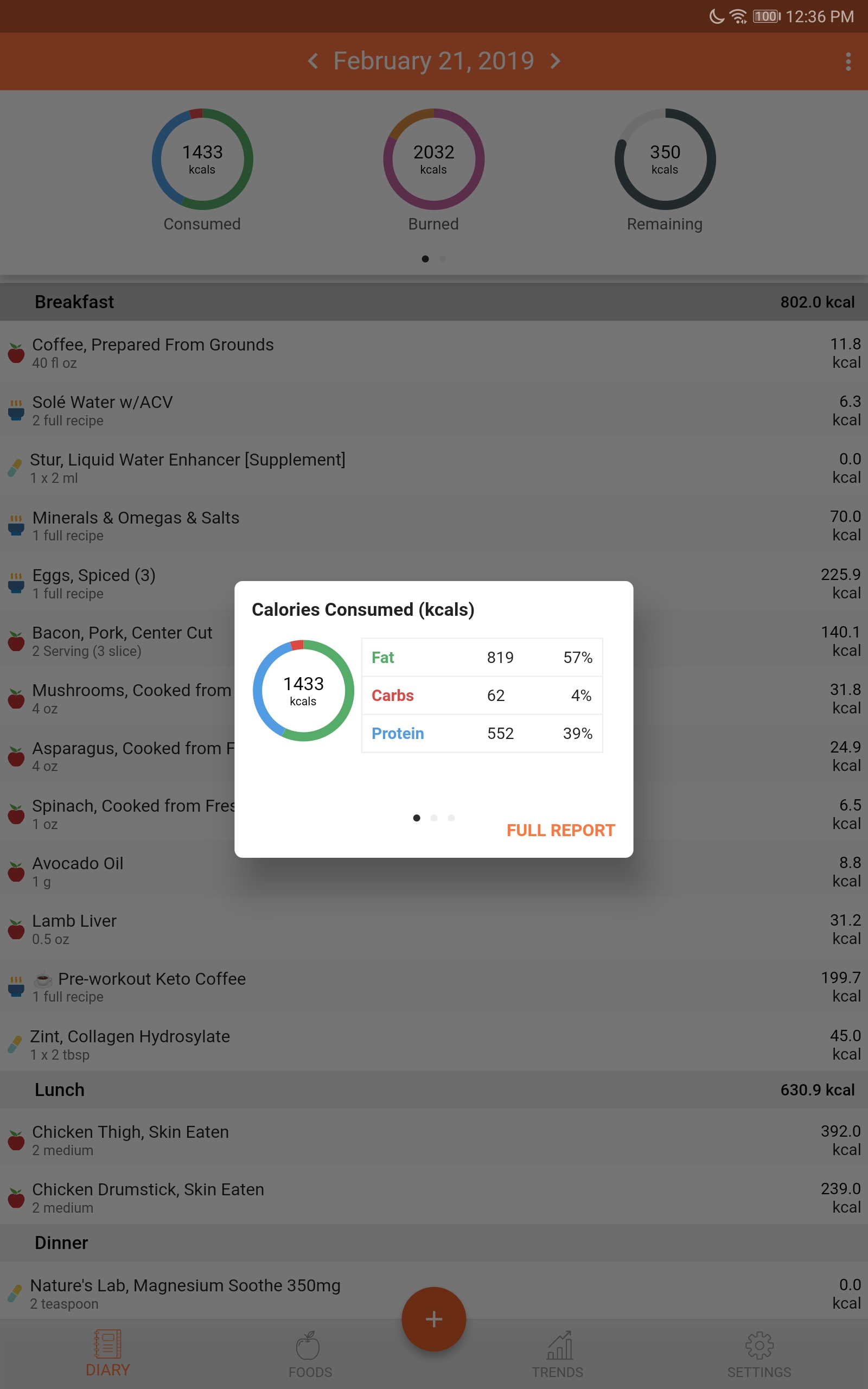
- Is this popup really necessary? Just take me to the full report instead of making my click again. The full report shows all of this summary info right at atop of page. Why do I need this little popup? If this popup is staying, then when exiting the full report using back button, go back to main screen at least. Right now, exiting full report still has the summary popup displayed so I have to hit back button a second time.
And finally, I'm super excited you fixed one thing that was irritating to me -- when clicking on a micro-nutrient to see what foods contributed to it and then clicking back button to go back to main nutrient list, you keep the page scroll position instead of jumping back to top of page and making me scroll back down again every time. Sweet! Thank you!!