Sneak peek of iOS apps new diary screen


We're making the final tweaks to a big update to our mobile app. Here's a sneak peak of the new design.
- We've made the diary text and colors crisper and easier to read.
- We've moved the top level navigation tabs to the bottom along with an easy to reach + button to log items.
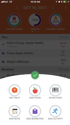
- The top summary area swipes through several different infographics to show macro numbers, and other key information.
Let us know what you think!

Clicking the ( + ) button brings up all of the options for adding items to the diary, including a faster way to bring up the barcode scanner:
Aaron Davidson
CEO, cronometer.com
https://forums.cronometer.com/discussion/27/governing-terms-and-disclaimer
Comments
-
I like it but actually think it would be better if the "+" were more streamlined to the things we need to do on-the-go: Add Food, Scan Food, Add calories (a much-needed feature).
The items that aren't frequently needed to do rapidly on-the-go (e.g. Activity, Biometric, & Help) could be relegated to an "Other" button on the "+" screen, or at least to the bottom of the list.
Let's face it, most of us will remember to add that we exercised for X minutes, but it's way too easy to forget that we snarfed down a handful of peanuts. Hence the focus for "+" should be on food/drink intake.
WFPB + No-Added-Oil = EZ Wt Maint & Rocket Fuel for Your Health!
-
Love love love the new update. Nice job guys and gals. 😁
-
Thanks @ryan!
Aaron Davidson
CEO, cronometer.com
https://forums.cronometer.com/discussion/27/governing-terms-and-disclaimer

