Optional food category icons in Diary instead of only 🍎

Hi Cronometer team,
Small visual feature request: could we get an optional setting to show food category icons in the Diary instead of using the same 🍎 icon for every food item?
For example:
- 🥛 Dairy and Egg Products
- 🥩 Beef Products
- 🐟 Finfish and Shellfish Products
- 🥜 Nut and Seed Products
- 🍞 Cereal Grains and Pasta
- 🍓 Fruits and Fruit Juices
- 🥦 Vegetables and Vegetable Products
- 🍬 Sweets
- 🧄 Spices and Herbs
- 🍝 Restaurant Foods
The diary currently uses the same 🍎 icon for every food item, except supplements, biometrics, etc. It works, but visually everything blends together. For entries like milk, almonds, oats, sugar, juice, berries, and salt, the apple icon does not really add much information.
To illustrate my point, here's a screenshot of where the repeated 🍎 icon becomes superflous instead of adding meaningful information.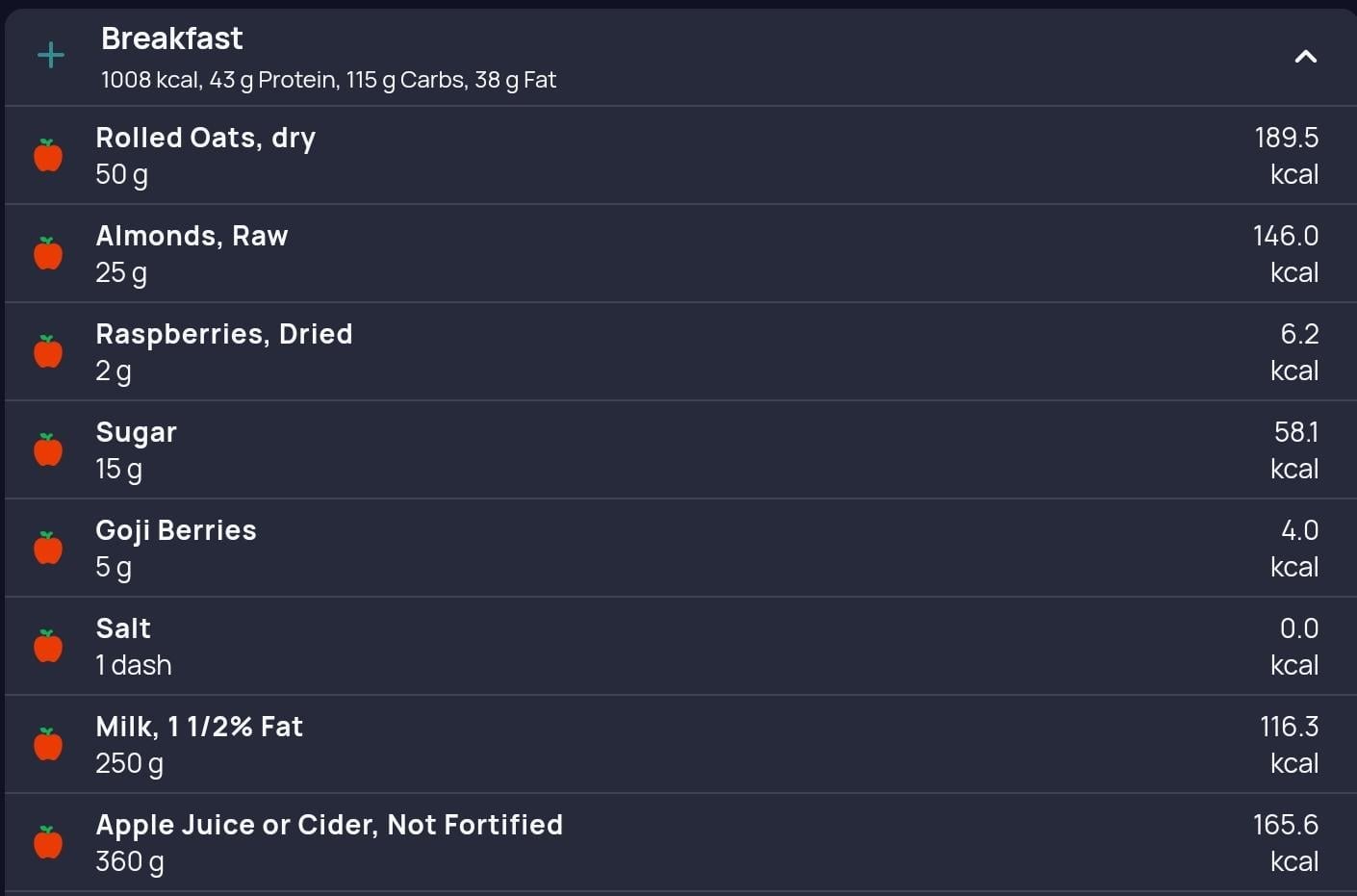
A few reasons I think category icons would be helpful:
- Faster visual scanning: When reviewing a meal, category icons would make it much easier to quickly understand what the meal is made of without reading every item line by line.
- Better meal composition awareness: Seeing icons for dairy, grains, nuts, fruit, drinks, and added sugar could help users notice patterns more easily, such as "this breakfast is mostly grains and juice" or "I could add more protein or vegetables."
- More intuitive and polished: Diary UI Cronometer already provides very detailed nutrition data, so category icons would add a nice visual layer that makes the Diary feel more informative and friendly without changing the underlying data.
I think this should definitely be optional, maybe under Diary settings:
Food item icons:
[ ] Generic food icon
[x] Category icons
[ ] No icons
That way users who prefer the current clean look can keep it, while users who like visual cues can enable category icons.
Thanks for considering it. Cronometer is already great, and I think this would make the Diary even easier to use at a glance.