Make Reports account for nutrient storage / active nutrient windows

Hi everyone,
I really like using Cronometer for tracking calories, macros, and micronutrients, especially the Nutrition Report feature. However, I think there is one area where the current report view can be a bit misleading: nutrient averages over longer date ranges.
Right now, the report is very useful for showing average daily intake across a selected period, such as the last 7 days, or custom ranges for Gold users. That works well for many things, but not all nutrients behave the same way in the body.
For example, some nutrients are relatively short-lived and need more regular intake. Vitamin C and many B vitamins are water-soluble, so excess intake is generally not stored in the same way as fat-soluble nutrients. On the other hand, vitamins A, D, E, and K are fat-soluble and can be stored for much longer. Minerals and fatty acids also vary a lot depending on the specific nutrient.
Because of this, a longer report average can sometimes create the impression that I am consistently meeting a target, even if the actual intake pattern is very uneven.
Example:
- I eat a lot of vitamin C-rich foods on Monday
- Then I barely get any vitamin C for the rest of the week
- The 7-day average might still look acceptable
- But from a practical nutrition perspective, that Monday spike may not be equally relevant by Sunday
This becomes even more important with longer reporting windows. If I look at a monthly report and had very high intake of a short-lived nutrient at the beginning of the month, the average may still look good near the end of the month, even though that intake may no longer be very relevant.
Main idea: active nutrient window shading in reports
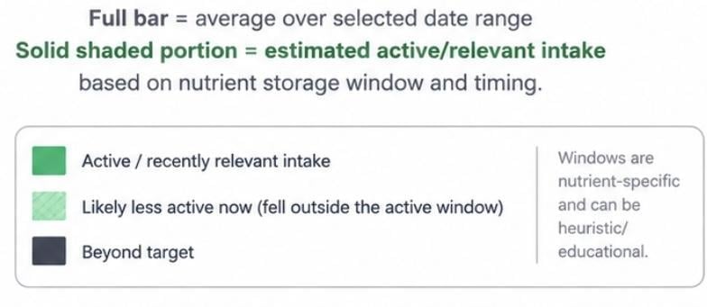
My main suggestion would be to add a visual overlay or shaded stacked bar to the Nutrition Report.
The report could still show the normal average intake for the selected date range, but part of the bar could be shaded differently to indicate how much of that intake is likely still relevant based on the nutrient's expected storage or active window.
For example:
- Short-lived nutrients could fade quickly
- Fat-soluble vitamins could remain visually "active" for longer
- The user would then see both the selected date range average and a more biologically relevant recent-intake estimate
So instead of only seeing:
"Vitamin C: 100% average over 7 days"
You might see something like:
"Vitamin C: The full bar represents the 7-day average, while 70% of that bar has a stronger shaded portion to show how much of that intake is estimated to still be recently relevant."
Or visually, the current report bar could stay mostly the same, but with a shaded overlay. The total bar would still represent the selected report average, while the stronger shaded portion would represent the nutrient's estimated active/relevant window based on when it was consumed.
I think this would make the report much more informative, especially for users who rely on longer averages. It would help show the difference between "I averaged enough over this date range" and "I have had enough of this nutrient recently."
This does not need to be treated as a precise medical calculation. Even a rough heuristic or educational visual indicator would be useful.
Alternative / simpler versions
If a full dynamic overlay is too complex, there could be simpler implementations:
1: Label nutrient-specific averaging guidance
Cronometer could label nutrients by recommended tracking style, for example:
- Best tracked daily
- Best tracked weekly
- Long-term average is acceptable
- Storage varies / context dependent
2: Small disclaimer next to affected nutrients:
For example:
"Vitamin C is water-soluble and is best interpreted with recent daily intake rather than long-range averages."
3: Report warnings for uneven intake:
If a nutrient target is technically met by the average, but most of the intake came from one or two days early in the range, Cronometer could flag it with something like:
"Average met, but recent intake has been low."
4: User Toggle in Report
Another possible implementation could be to avoid the visual shading entirely and instead make the report average itself nutrient-aware.
For example, Cronometer could offer a toggle between:
- Pure average: the current mathematical average over the selected report period
- Active estimate: an adjusted view where nutrients "decay" differently depending on how they are stored or used by the body
So if I eat a fat-soluble vitamin near the beginning of a 7-day period, it could still have a stronger impact on the active estimate later in the week. But if I eat a large amount of a short-lived water-soluble vitamin at the beginning of the period, its impact would decay faster.
In other words, the report could still use the same date range, but the nutrient calculation would be weighted based on the expected storage/active window of each nutrient.
That might be simpler visually than adding shaded bars, while still solving the same issue: showing the difference between "I averaged enough over this period" and "my recent intake is likely still relevant."
The key thing would be making it optional, because the pure average is still useful. A toggle would let users choose whether they want the standard report or a more biologically contextual "active nutrients" view.
Why this would be useful
I think this would help users avoid misinterpreting long-range averages. Averages are helpful, but for nutrients with shorter storage windows, they do not always tell the full story.
This would also make Cronometer's reports feel more nutrition-aware, not just mathematically correct. The app already tracks a lot of detailed micronutrient data, so adding more context around how to interpret that data could be really valuable.
Curious what others think. Would something like this help you interpret your nutrient averages more accurately?
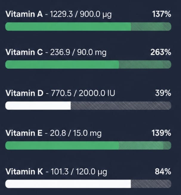
Concept Ideas:
Current Nutrition Targets: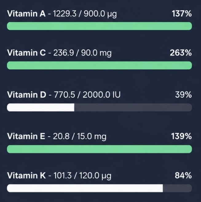
Shading Idea based on "Active" nutrition: