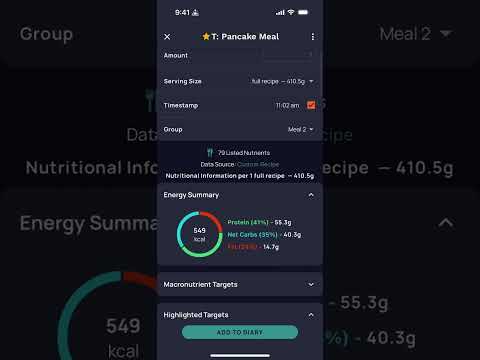
UX Improvements: (1) Auto-explode option, (2) repeat item limitations, (3) Delete function
I created a video covering three (3) issues with the Cronometer application. All relate to improving the UX.
- Repeat Items. Currently, these are stale snapshots. They are not using the updated definition of a recipe going forward on new days.
- Auto-explode. This is a feature request. This would help us users who are always fine tuning quantities and ingredients in certain 'recipes' that are more like starter templates. I am not asking for this on every recipe. I am asking to give us the option to set certain recipes (or meals) to auto-explode when added to the diary.
- Delete Function. Currently, it is annoying. The UX is really bad here. If I delete several items in a row, I am blocked by the UI from adjusting the quantity of anything else. That is, I can enter a new quantity value, but the 'Save' button is constantly blocked by flash messaging about queued up deletions.
Some context: I serve in product design for mobile apps and web applications, interfacing with graphic designers and functional experts. Good UX is my job.
A link to my video of the same:  https://youtu.be/vWwrJ7fZ27I
Comments
-
I appreciate your commenting on this. I don't know that I fully understood or agree with your proposed solutions, but I would like to see some added flexibility to make recipes more useful.
It seems I rarely use the same exact recipe twice. For example my pizza recipes have variations in the crust I may use and sometimes the inclusion or exclusion of some toppings. These variations are so many that I end up just creating another recipe from another one and calling it V2.1 or by using a date code in the name. I end up with a plethora of pizza recipes that I only use once.
The recipe function is still important because it creates the servings or portions (slices in this case) and does the math on that. Just entering the recipe as individual diary entries each day would be tedious and require dividing each ingredient by the number of slices in this case that you eat for that meal.
What I would like is for your UI experts to take a look at is how one might use the recipe function such that when a serving from a recipe item is added to the diary it would show up with an expand icon that would allow you to customize the recipe just for that entry/meal. The customization could range from simple recipe quantity changes to ingredient additions and deletions. That may jump you back to the recipe entry page, but the intent is not to replace the original recipe, but to essentially create a variant based on the original. When the customization is done, you should be able to collapse back to the recipe entry, possibly with an amended name or date code.
Whether these recipe changes are saved as variants under the original recipe or not is something to think about. How changes to a base recipe should affect past diary entries is another question. Maybe the past is the past and updates only change things moving forward. I don't know. I don't have all those answers. I'd just like some thought put into making recipes more useful.
-
Thanks for your comment, @CYCLNZ. We're actually advocating for something very similar. Not sure if you saw my attached video; it expands on this key idea:
- Many of us use a recipe as a starting point, and when adding it to our diary, want to make some fine adjustments at the point of entry.
- We don't want to have to manually explode the recipe entry in our diary each time.
- We want an easy way at the point of adding it to our diary to make quick adjustments without disturbing the recipe definition.
In advanced cases, having the option to save the changed version as a variant we can preselect in the future, would be a bonus.
At the core, most of us use recipes as a starting point, and want a more expedited way to make adjustments at the point of logging in our diary.
-
We are seeking a solution to the same problem. Yes I did watch the video. Your discussion was clear, but it was a little hard to identify what you were referring to in the video with all the jumping around as I scanned the page.

